Visual & Brand Design

Brand & Packaging Design

Work from my time as a full-time Graphic Designer at Bhamisa Food & Beverage Pvt. Ltd. in Kathmandu, Nepal — product labels, brand identity, and packaging that went to market.


EKAA Kombucha — Brand & Label Design

Full brand identity and flavor-specific label system for a kombucha product line manufactured and sold by Bhamisa Food & Beverage. Each flavor got its own color system and illustration style while maintaining a consistent brand architecture across the range.

The label design had to carry legal requirements — nutrition facts, ingredients, disclaimers, batch info — while staying visually appealing on shelf. Balancing regulatory content with brand expression across a 300ml bottle format was the core design challenge.
CompanyBhamisa Food & Beverage Pvt. Ltd.
LocationKathmandu, Nepal
PeriodNov 2020 – Jul 2021
RoleGraphic Designer (Full-time)
Scope
LogoBrand identityLabel designColor systemsIllustration
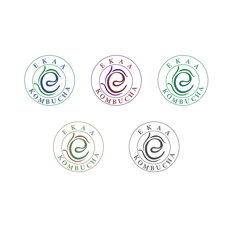
EKAA Kombucha logo variations

Logo system. Five color variants of the EKAA Kombucha mark — each tied to a specific flavor line. The circular seal format and spiral motif were designed to read well both on label and on cap.

Primary brand color palette

Primary brand palette. Forest green, navy, and steel blue form the core identity system — grounding the brand in natural, health-forward associations.

Ananas (Pineapple) Flavor

Each flavor required its own color system derived from the fruit itself. The Ananas label uses a warm orange-yellow palette with tropical leaf illustrations — designed to communicate freshness and flavor before the consumer reads a single word.

Ananas flavor color system

Ananas color system. Warm amber through orange, with green and blush accents. Each hex value was selected for how it reads under retail lighting conditions.
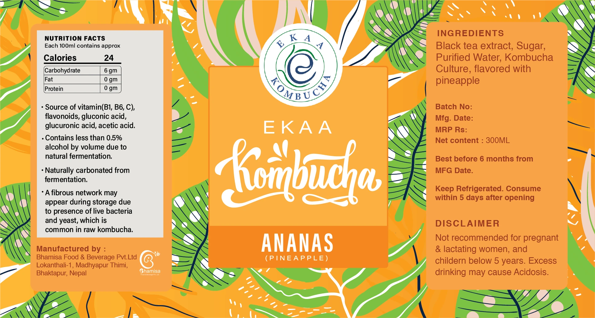
Ananas label flat design

Ananas label — full flat. The complete 300ml wrap including nutrition facts, ingredients, disclaimer text, and batch info — integrated without dominating the visual hierarchy.

Product Photography

Final labels on product — shot in real environments. Five flavors: Fresa (Strawberry), Le Mento (Lemon Mint), Ananas (Pineapple), Blue Ginger, and Giloy.
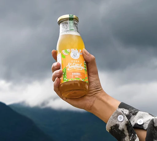
Ananas bottle in hand against mountains

Ananas (Pineapple) — outdoor lifestyle shot against mountain backdrop.
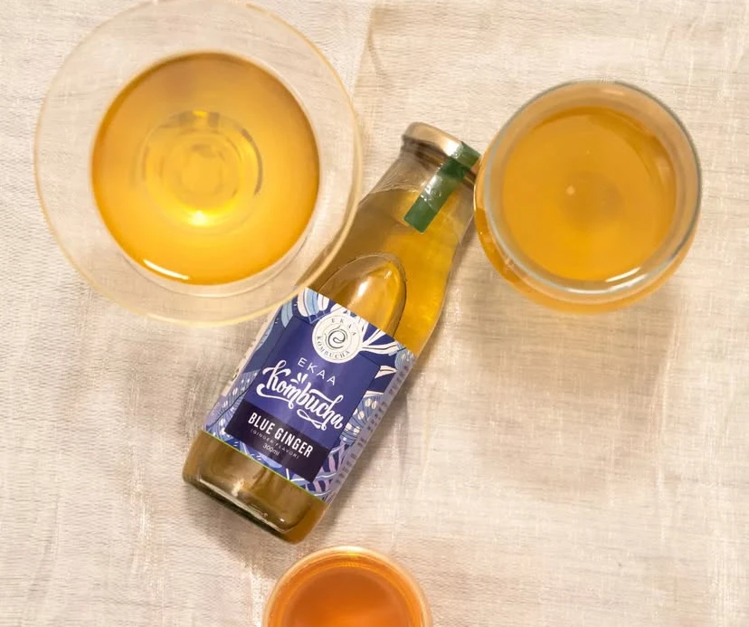
Blue Ginger flat lay with glasses

Blue Ginger — flat lay with kombucha poured into glasses.
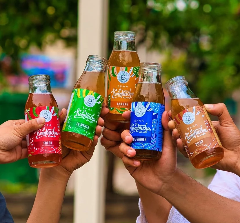
All five kombucha flavors held up

Full flavor range. All five flavors together — Fresa, Le Mento, Ananas, Blue Ginger, Giloy. Each label reads as distinct while clearly belonging to the same family.

New One — Supplement Packaging

Packaging design for a nutritional supplement (Methylcobalamin, Folic Acid, Pyridoxine Hydrochloride & Zinc Capsules) manufactured by Bhamisa. A different design register from the kombucha range — pharmaceutical packaging requires a cleaner, more authoritative visual language while still needing shelf presence.

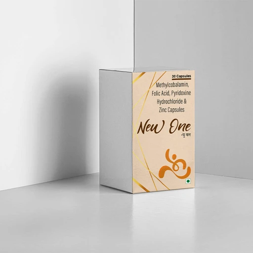
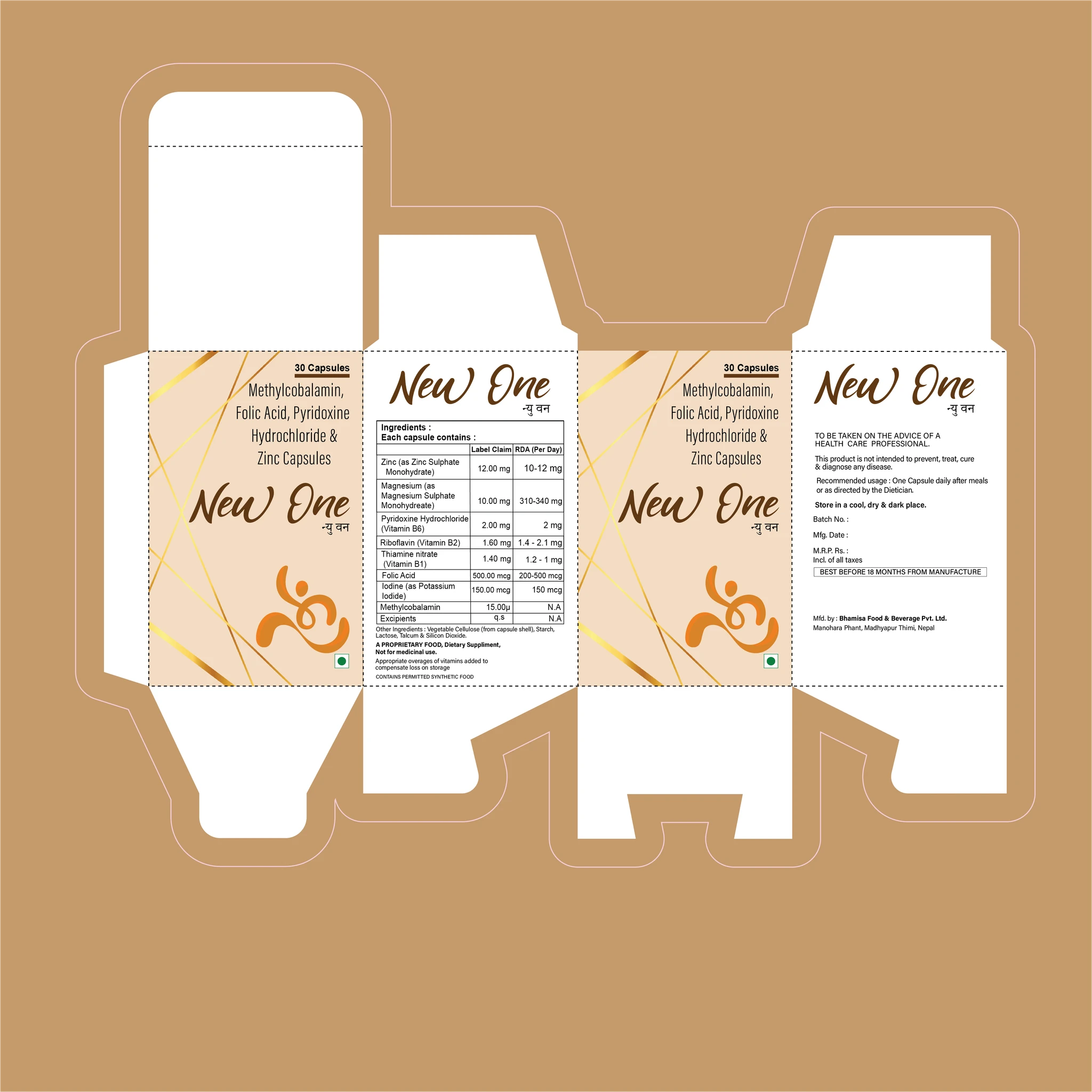
The design uses a warm cream and gold system to position the product as premium and trustworthy. The full dieline was designed to work as both a flat print file and fold correctly into the finished box.

ProductNew One — Dietary Supplement
Format30-capsule carton box
Scope
Packaging designDielineColor systemTypography
New One color palette

New One color system. Warm cream, deep brown, and amber gold — a deliberate step away from clinical white-and-blue pharmaceutical packaging toward something warmer and more premium.

New One box 3D mockup

3D mockup. Final box design showing front face with gold foil diagonal detail, script logotype, and the brand mark.

New One packaging dieline

Full dieline. Complete print-ready flat including all four panels — with full ingredients table, dosage, legal copy, and manufacturer information.


Real products. Real constraints.

This work was done as a full-time role — not academic projects or side work. These labels went to print, onto bottles, and onto shelves. The design decisions had real consequences: a label that confused customers wouldn't sell, and a dieline that didn't fold correctly would fail at the printer.

I'm not showing this work as UX case studies — there was no formal research process or usability testing. What it demonstrates is a different kind of design skill: working within tight physical and regulatory constraints, balancing visual appeal with mandatory content, and executing across a product family with consistency.

That discipline — of designing within constraints you didn't choose — is something I bring into every UX project.