UX Design & Research Mobile Figma Jan – Mar 2026

WayWeGo: Simplifying Group Travel Planning

A mobile app designed to replace the fragmented mess of WhatsApp threads, shared Google Docs, and scattered booking links — with one structured space where groups plan, decide, and stay aligned.

0User interviews
0Usability participants
0Research rounds
0Project scope
Shipped
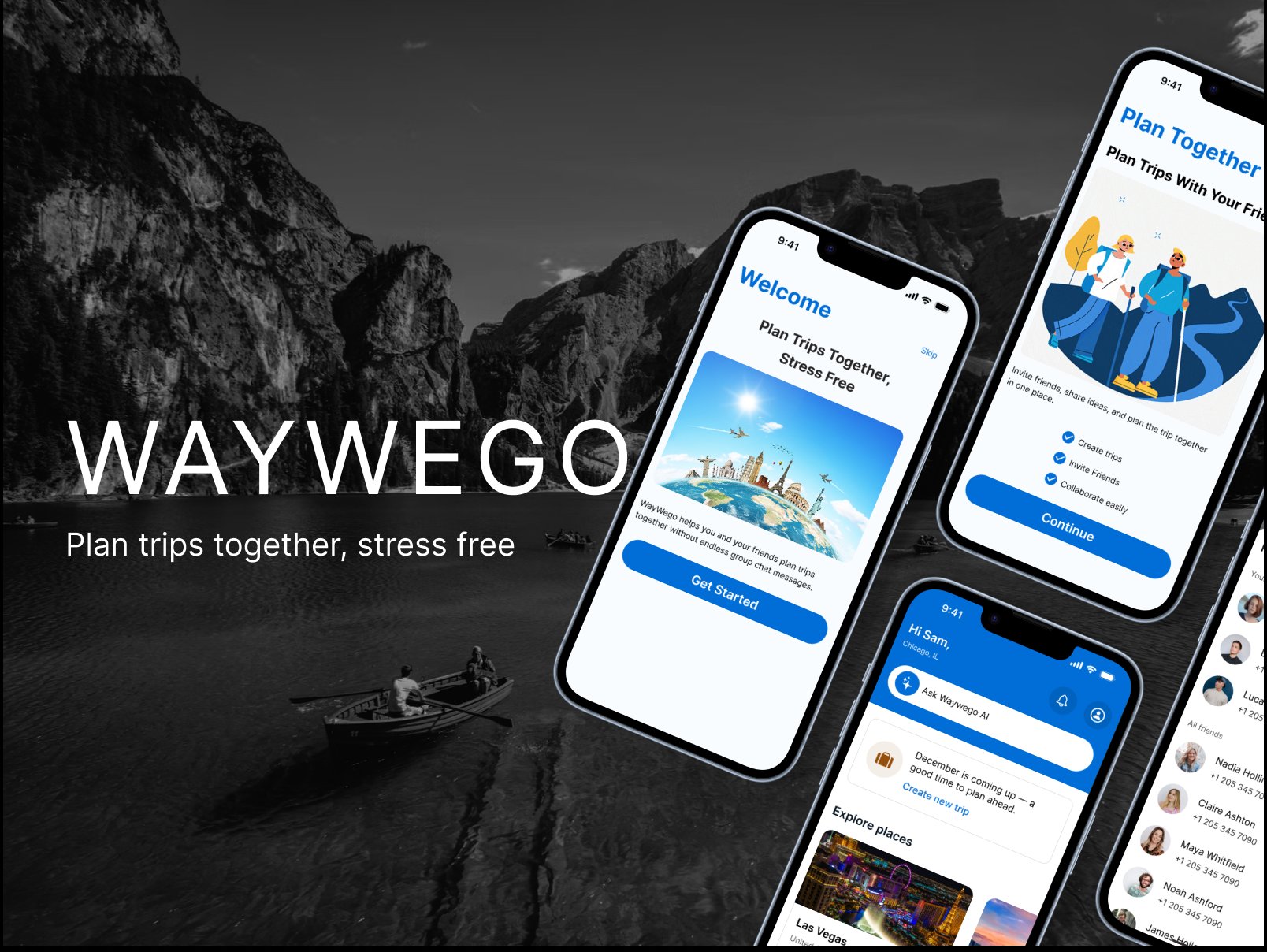
WayWeGo cover

Planning a trip with friends sounds fun — until it actually starts.

People don't struggle to find flights or hotels. They struggle to agree. Every group trip runs through the same broken stack: WhatsApp for chasing responses, Google Docs for organizing ideas, Airbnb for searching options — and one person absorbing all the coordination overhead.

The problem isn't information. It's group dynamics.

01

Endless back-and-forth

Group members read messages and don't respond, leaving the organizer in limbo.

02

One person does all the work

Someone always becomes the "trip manager," chasing responses and making final calls alone.

03

Too many tools, no single source of truth

WhatsApp + Google Docs + Airbnb creates fragmented, stressful coordination.

04

Decision fatigue before anything is booked

Too many options and no structure leads to paralysis and rushed, unfair decisions.

What 6 interviews revealed.

I conducted semi-structured interviews with 6 participants aged 21–36 (4 female, 2 male), each with recent group travel experience. Sessions ran 30–45 minutes via Zoom, Google Meet, and in person. I synthesized findings into an affinity diagram, which surfaced 6 recurring themes.

01

Reaching agreement is the hardest part

Different expectations about the trip type made every decision emotionally draining. Decisions felt rushed or unfair when not everyone had a voice.

02

Stress happens before anything is booked

Coordinating availability kept plans in limbo for weeks. People waiting on uncommitted friends felt like the trip was always "almost happening."

03

No dedicated tool exists for group planning

Everyone cobbled together WhatsApp + Google Docs + Airbnb. One person inevitably absorbed the organizational burden.

04

Slow communication kills momentum

"Read receipts but no reply" was a universal frustration. Repeated follow-ups made planning feel like work, not fun.

05

Equal voice matters more than efficiency

When shown two decision models, most participants chose the Nominal Group Technique — even though it takes longer — because it guaranteed everyone could share their opinion.

06

Users want one app, not fewer apps

The ideal experience was described as "simple, organized, and stress-free" with everything in one place — not a marginal improvement to existing tools.

"A decision was made before everyone had a chance to share their opinion — that led to real frustration and a sense of being unheard."

Interview participant, age 28

From paper to high-fidelity in three phases.

The design followed an iterative, test-driven process — each phase informed by what failed in the last one.

01

Low-Fidelity Sketches

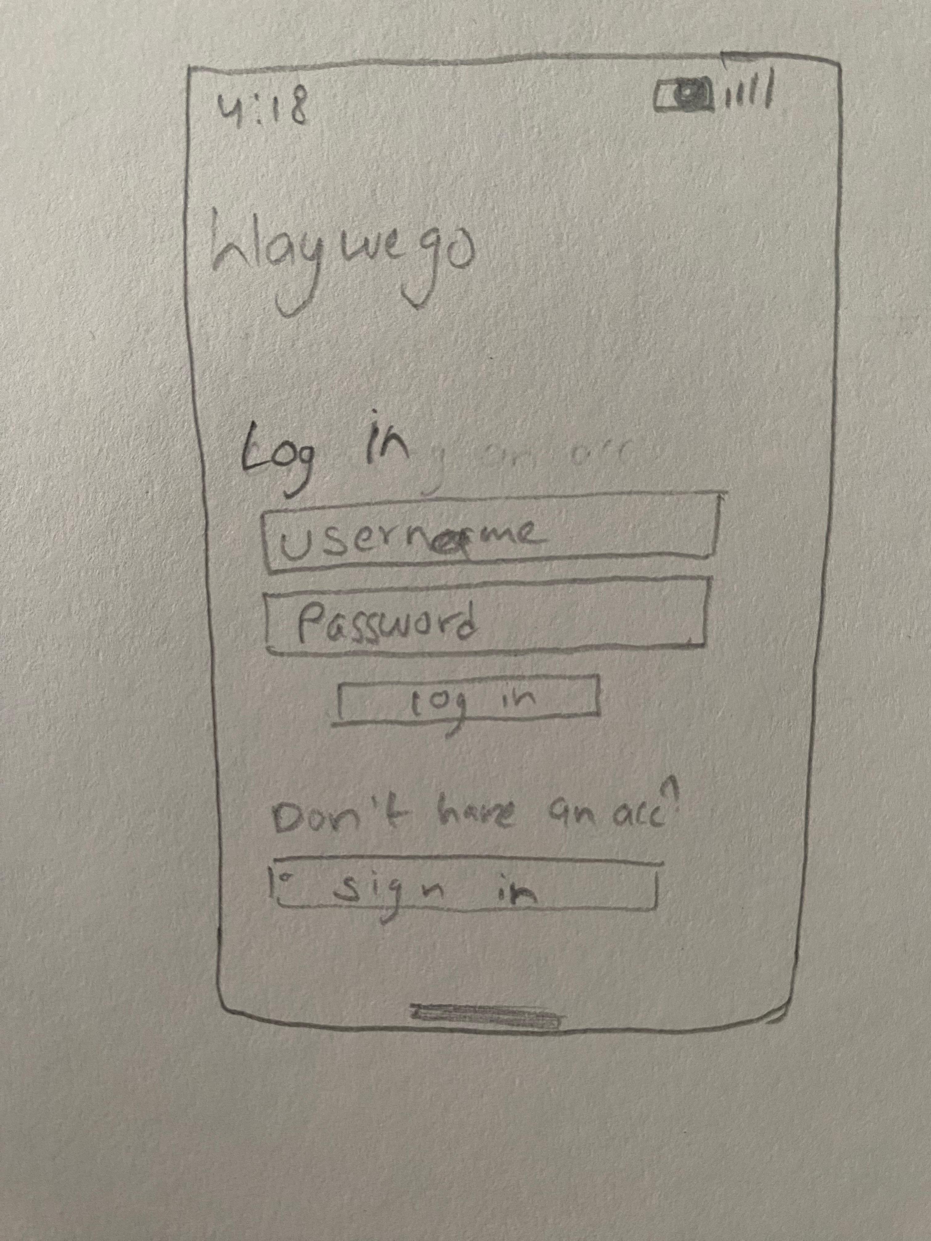
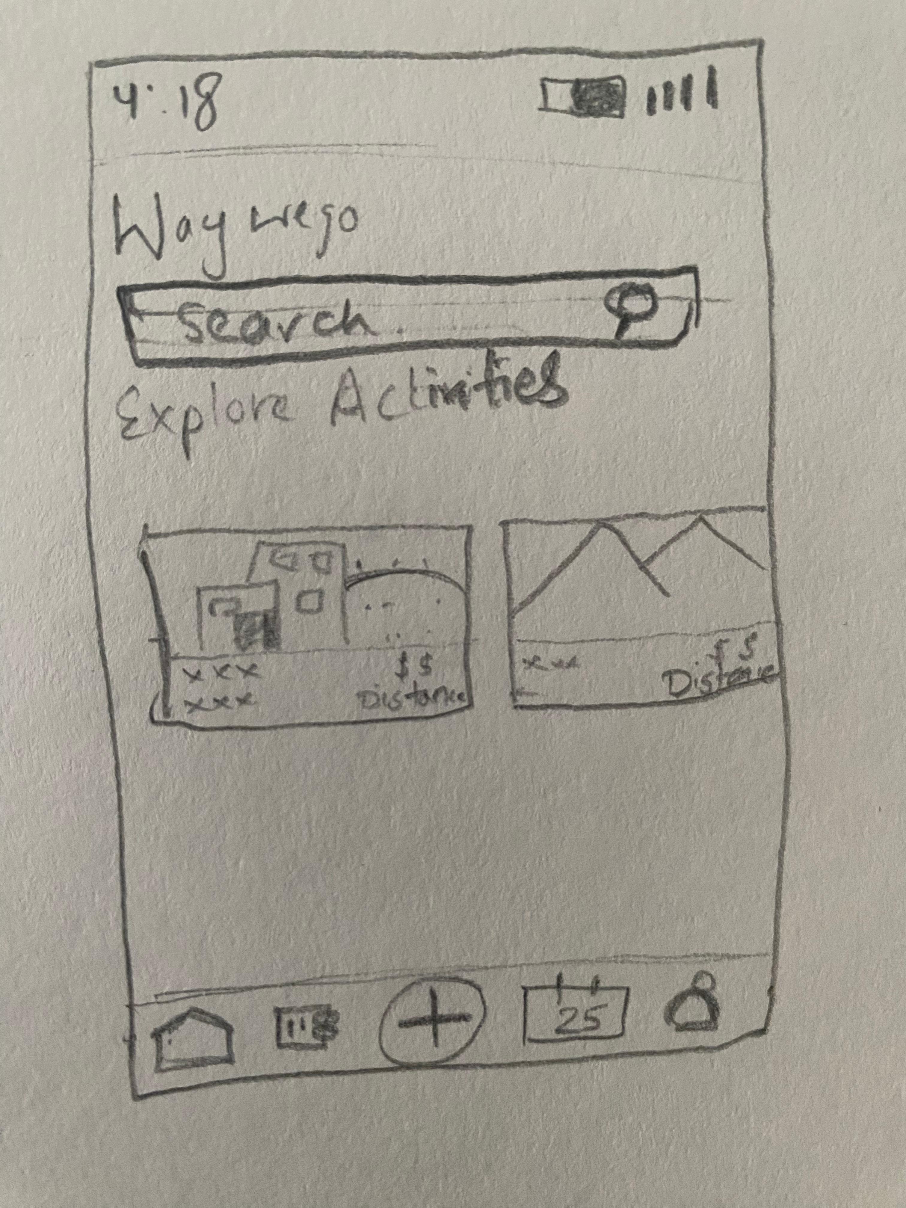
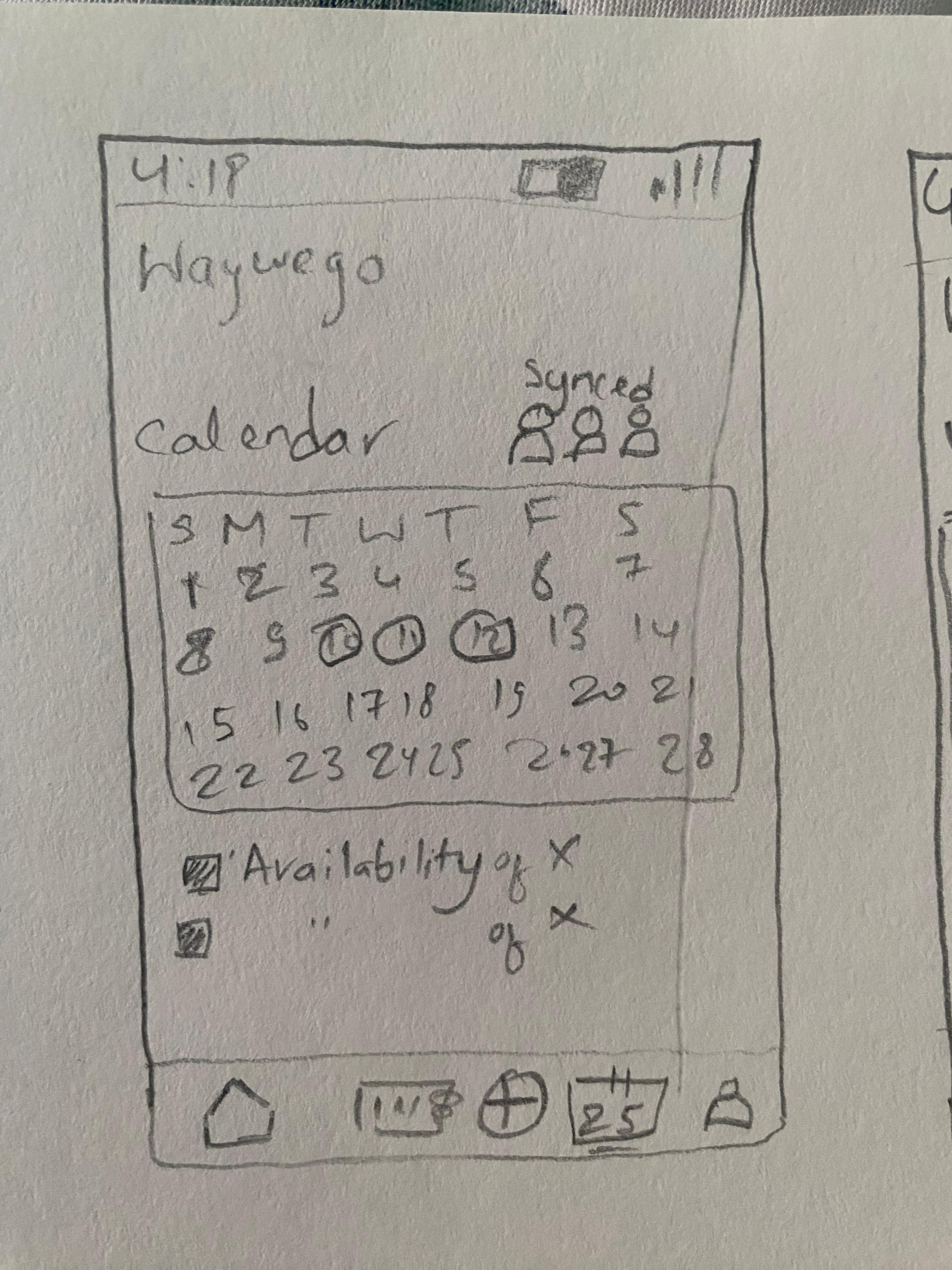
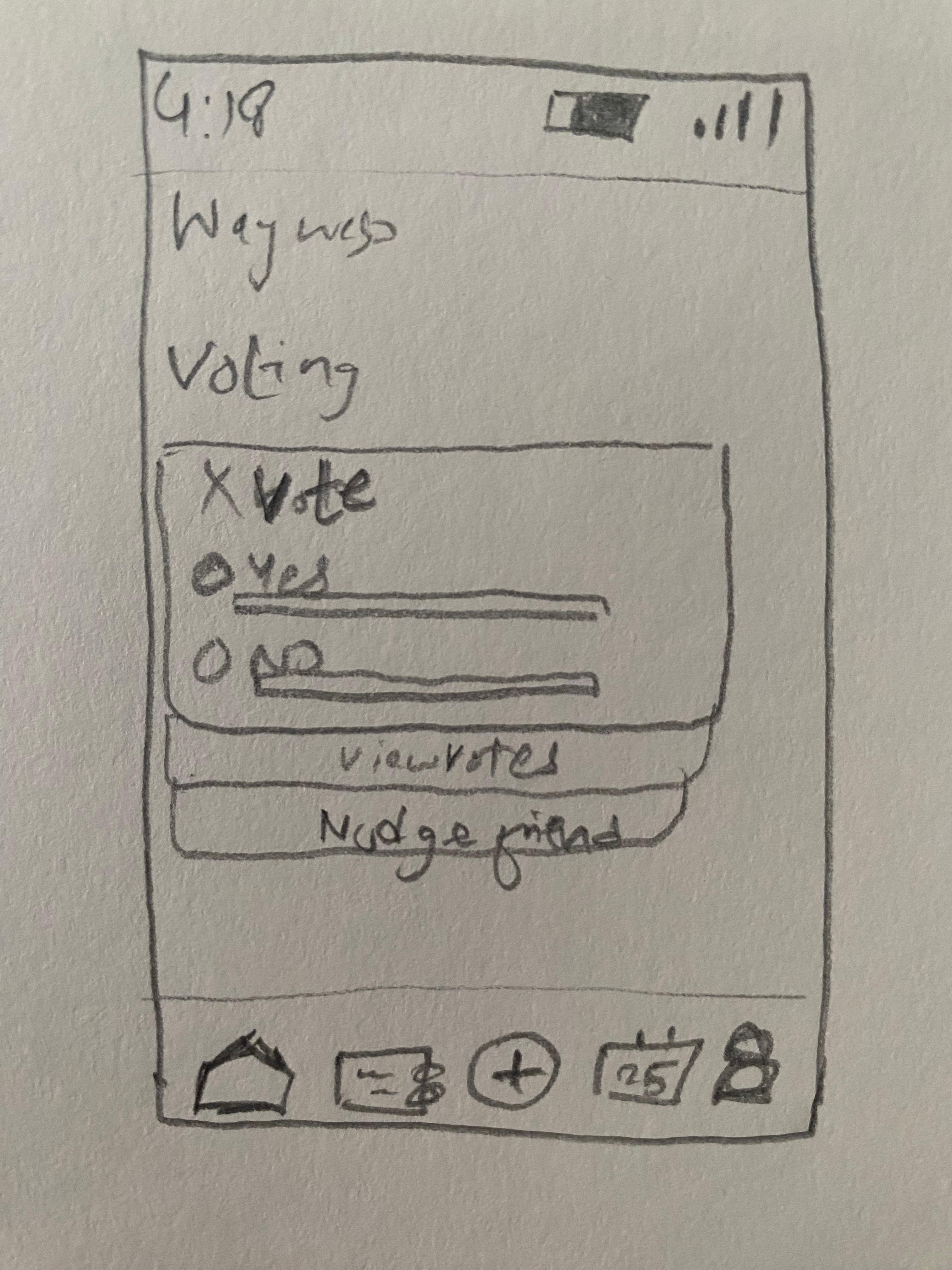
Paper sketches explored how group decisions could be structured and how users would initiate trips. Key screens sketched: Login, Home/Explore, Calendar/Availability, and Voting with a "Nudge friend" action.

02

Mid-Fidelity Prototype

Wireframes introduced clearer navigation and defined key flows. These were tested with 5 participants using think-aloud protocol and ASQ scoring to validate structure before visual polish.

03

High-Fidelity Refinement

The final prototype addressed the biggest gaps from mid-fi testing: system feedback, calendar clarity, and a voting flow built on the Nominal Group Technique. Evaluated with 5 participants using SUS + ASQ.

Starting on paper.

Early sketches focused on the four core screens identified from research: authentication, home/explore, availability syncing, and group voting. The "Nudge friend" button on the voting screen directly addressed the research finding about slow communication.

Login screen sketch
Login / Onboarding
Home / Explore Activities sketch
Home / Explore
Calendar availability sketch
Group Availability Calendar
Voting screen sketch
Voting + Nudge Friend

Structure before polish.

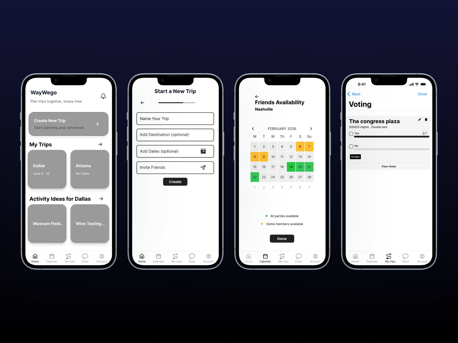
Mid-fidelity wireframes introduced navigation hierarchy and defined the three critical user flows. These were tested before any visual design work — the goal was to validate structure, not aesthetics.

Mid-fidelity prototype screens

"I expected the invite option to appear right after creating the trip."

P5, Mid-fi usability test

"Friends' availability should appear immediately on the first calendar screen."

P2, Mid-fi usability test

Two rounds of testing. Real numbers.

I ran two rounds of usability testing — first on the mid-fidelity prototype and then on the high-fidelity version. 5 participants each round, aged 23–32, tested via Zoom and in person using scenario-based tasks and think-aloud protocol.

Mid-Fidelity Testing (Round 1)

Task 1: Trip creation & invite5/5 completed
Task 1 avg. completion time~39 sec
Task 1 ASQ ease score3.6 / 5
Task 2: Availability syncing3/5 completed
Task 2 avg. completion time~50 sec
Task 2 ASQ ease score2.6 / 5
Task 2 perceived support score2.4 / 5

High-Fidelity Testing (Round 2)

Task 1: Trip creation & invite5/5 completed
Task 1 fastest completion27 sec (P1)
Task 1 ASQ ease scores4–5 / 5
Task 2: Availability syncing2/5 independent
Task 2 ASQ ease score2.2 / 5
Task 3: Voting on hotel1/5 independent
Task 3 ASQ ease score2.5 / 5
0

Above average usability threshold (68 = industry average)

"If it works, it looks like it'll be easy to use." — P2

Most people would learn this quickly (Q7)
3.8
Thought the tool was easy to use (Q3)
3.4
Functions worked well together (Q5)
3.2
Felt very confident using the tool (Q9)
3.2
Would use this tool frequently (Q1)
2.4

What the testing revealed.

The most consistent problem across both rounds wasn't missing features — it was missing feedback. Users repeatedly didn't know if their actions had registered.

Insight 01No confirmation after key actions.

The feedback gap undermined trust across every flow

No confirmation messages after trip creation, no visual acknowledgment after sending invites, no "you're done" signal after selecting dates. This issue appeared in Tasks 1, 2, and 3.

Insight 02Calendar was the biggest failure point.

3/5 mid-fi participants couldn't complete the availability task independently

Color-coding was ambiguous, the "pick dates" notification looked like an error, and users expected smart auto-fill once a date range was started. This persisted into high-fi testing.

Insight 03Voting concept was right, execution wasn't.

Right concept, wrong implementation

Users understood and wanted group voting. But showing only one hotel option made voting feel pointless. The idea was validated; the prototype wasn't complete enough to test it fairly.

Insight 04Trip creation was the clear success.

ASQ ease scores jumped from 3.6 to 4–5

All 5 participants completed Task 1 in both testing rounds, confirming the navigation revisions based on mid-fi testing were effective.

Final prototype.

The high-fidelity prototype focused on the three critical paths validated through research: onboarding, trip creation, and group decision-making. Visual design used a clear blue/white system to establish hierarchy and make interactive elements unambiguous.

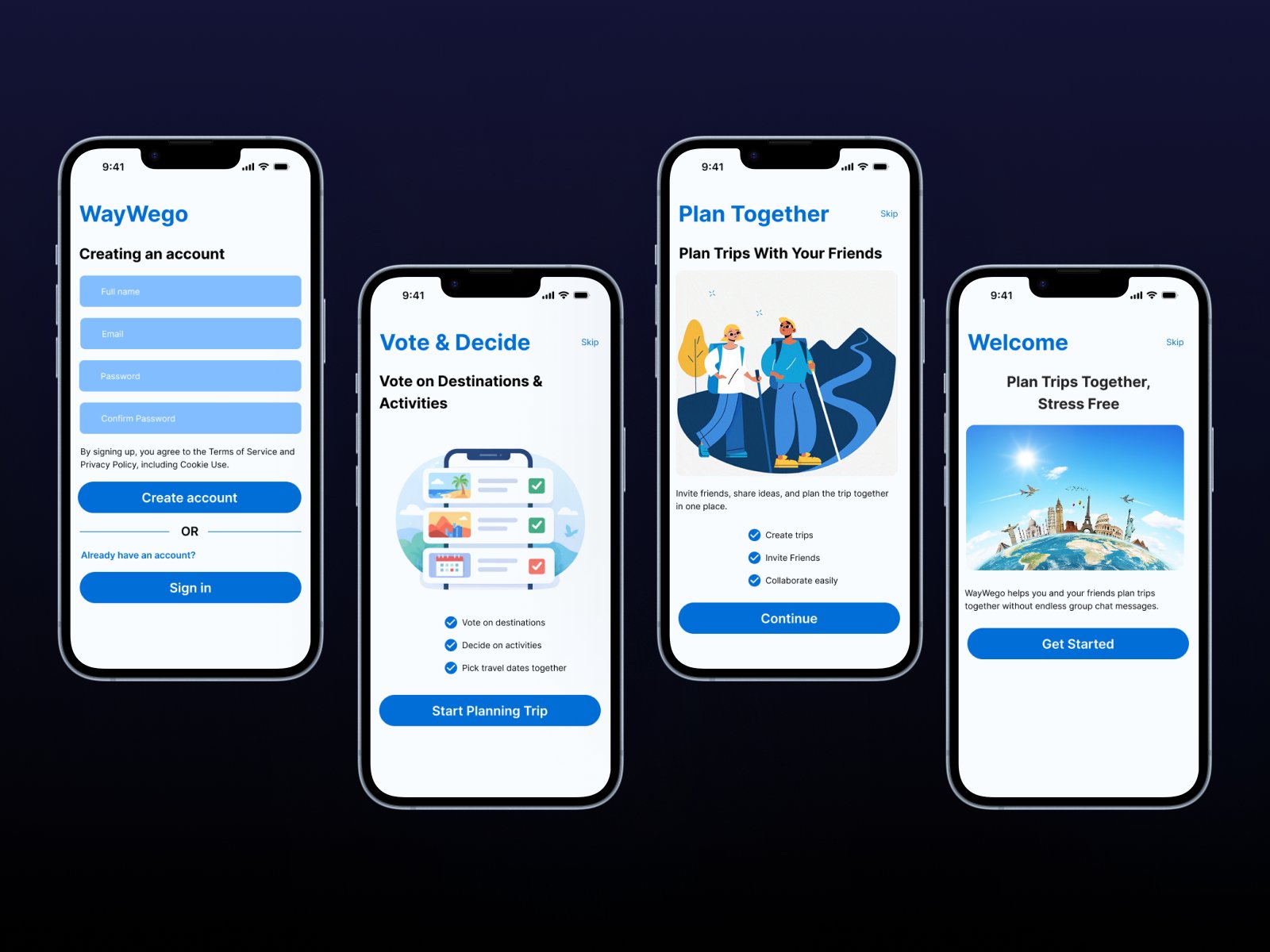
WayWeGo onboarding screens

Onboarding flow — Welcome, feature introduction, account creation. Three screens that set context before asking for commitment, directly addressing the research finding that users wanted to understand the app's value before signing up.

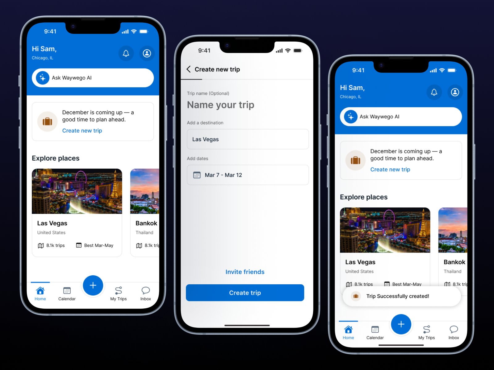
WayWeGo trip creation screens

Trip creation flow — Home dashboard, trip setup, and success confirmation. The "Trip Successfully created!" toast notification directly addresses the feedback gap identified in mid-fi testing.

Explore the interactive prototype

Click through the full flow in Figma — onboarding, trip creation, availability syncing, and voting.

View in Figma ↗

What I'd do differently.

The 10-week scope forced hard trade-offs. Budget tracking — a significant pain point surfaced in interviews — was cut entirely to keep the prototype scope manageable. That's the right call for a first iteration, but it's one of the most important unresolved needs.

The calendar needed a full redesign, not a revision. The mental model mismatch between "entering my availability" and "seeing the group's overlap" wasn't a labeling problem — it was an architectural one. Users wanted to see the group picture first, then confirm their own dates.

The voting feature concept was validated by research but never fully prototyped. A swipe-based interaction (suggested by P1 during testing) would likely perform better — it reduces the decision to a single binary judgment per option, directly addressing decision fatigue.

"WayWeGo is on the right track. The concept resonates and the onboarding flow works. But a group planning tool can't just organize information — it has to actively reduce uncertainty and show people that their input matters."

From the project discussion section